Realize is a learning management system that contains all of Pearson’s digital products. Teachers can assign work to students and create lesson plans in Realize. Only 6% of students starting homework sessions were able to complete and submit all parts of the assignment. How might we create a solution that allows students to turn in their assignment easily?
DATES
Jan 2018 to June 2018
TOOLS
Axure, Sketch, HTML/CSS/JS, Google Analytics
ROLE
UX Designer & Researcher
TEAM
Product Manager, Dev Team
Empathize
Google analytics & market needs
Based on Quantitative Research from Google Analytics, only 6% of our Students turn in their assignments. Additionally, we lost out on a large adoption sale because of frequent comments about how realize was “not a robust process for the student.”
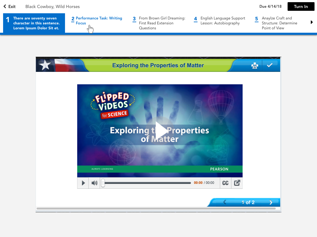
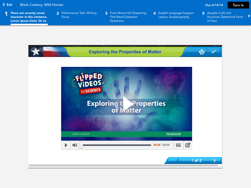
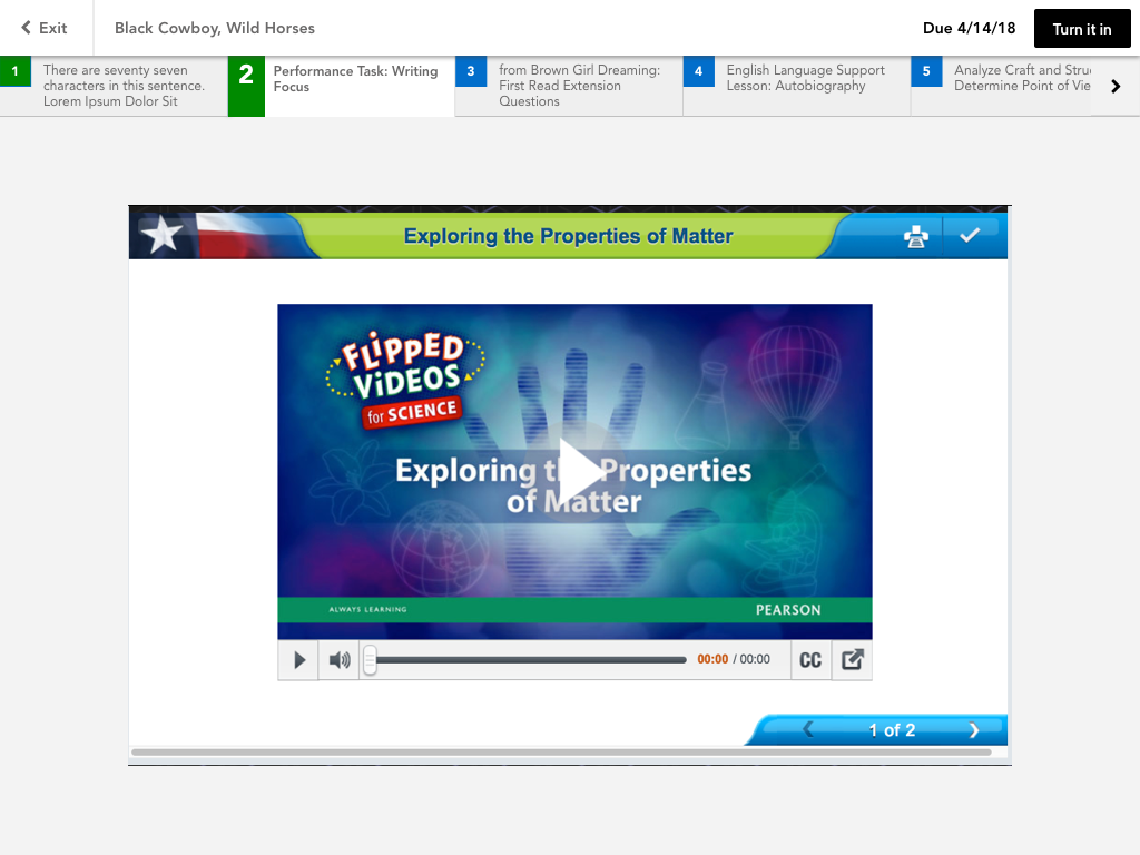
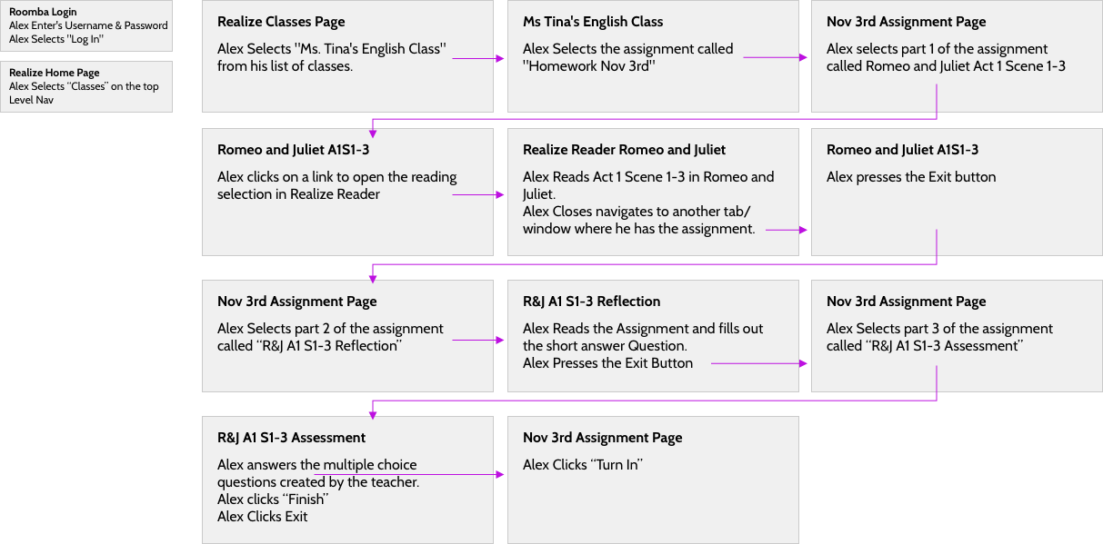
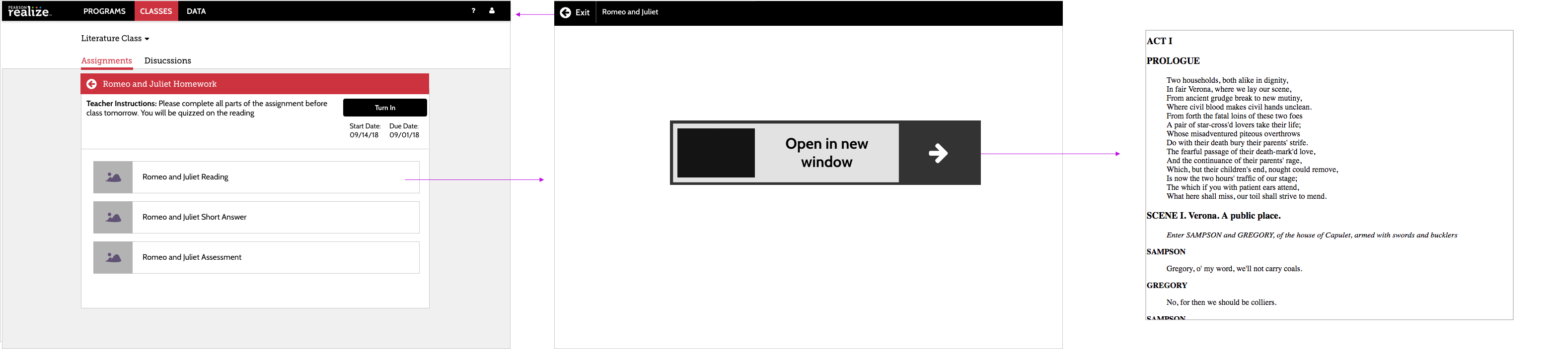
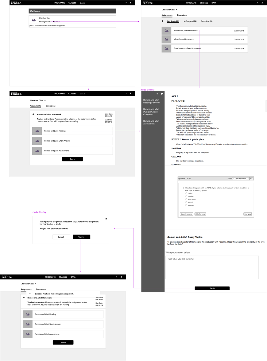
Current user workflow
Below is an outline of the general user workflow for completing and turning in an assignment, as well as approximate wireframes of the former solution.
Key problems include:
Constantly clicking back and forth to the assignment page
Far proximity of the turn-in button
Unecessary interstitial screens
Define
Competitive analysis
One of the goals is to have an advantage over our competitors. We looked at what our competitors were doing and how we could improve upon them. Additionally, we looked at other solutions to content heavy navigation.
McGraw Hill (our #1 competitor) has multiple parts to the assignment, but they are not customizable. Each part of the assignment has a forced structure. In other words, the content has stricter limitations. Our solution needs to be more scalable. We liked the simplicty of their text and icons
HMH (#2 competitor) does not support multi part assignments. Students must enter and exit the assignment, and the teacher can only assign 1 content item per assignment. Their approach is similar to what Pearson has currently.
We also looked at Google material design for Tab UI patterns. We liked the simplicity and the easy of use. We also noted that many of our target users use Google Classroom and other google products, so they may be familiar with this pattern already. However, Google’s design does not account for long titles like ours.
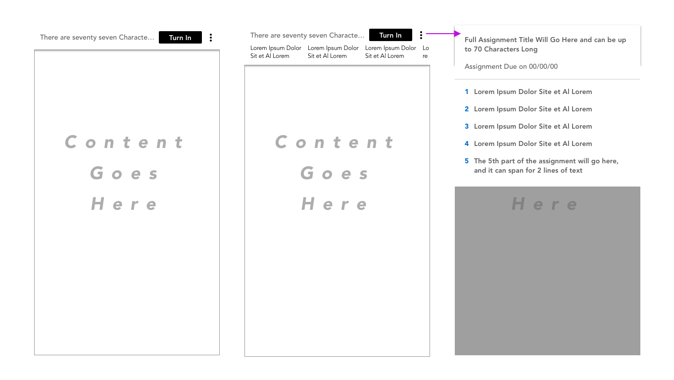
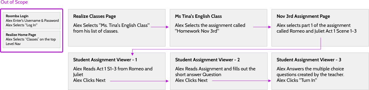
From the current designs, I worked with the Project Manager, Product Manager, different content teams, and my manager to create some requirements. These lead the updated UI workflow at a high level.
As a student, I can view all parts of my assignment in “assignment mode”
2
As a student, I want a structured path through my assigned work.
3
As a student, I know the status of each asset in my assignment
4
As a student I can turn in my assignment easily
5
As a student I can see a similar screen when accessing single item
6
As a student, I can view my assignment on a mobile device
7
As a content author, I can create content that is varied
Validate
Usability Testing & A/B Tests
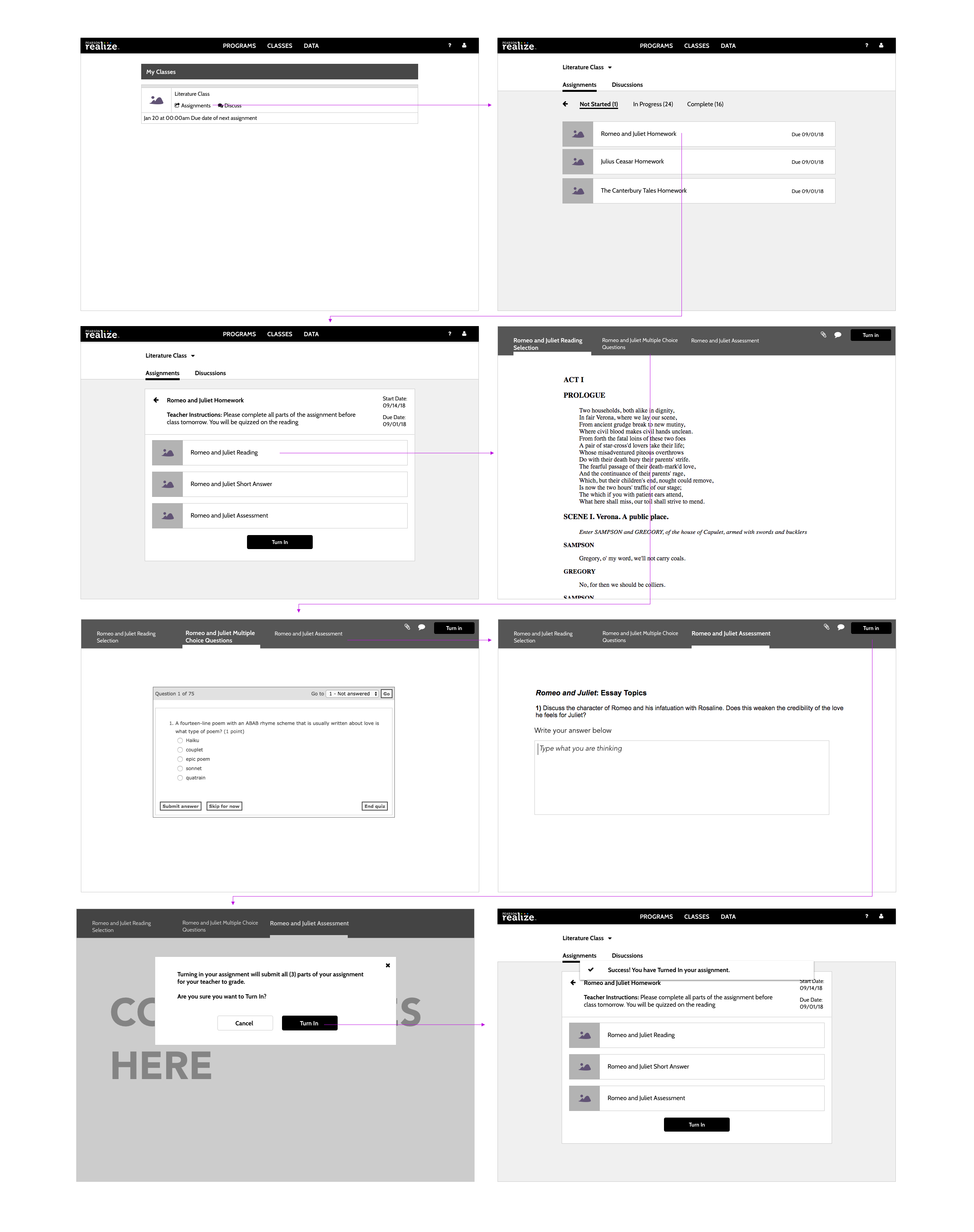
To validate that our designs, we combined an A/B test with a task based usability test. I created 2 different prototypes, based off of the competitve analysis and requirements. One solution has a long vertical scroll, the other has tabs. We ended up going with Prototype A.
What we did:
5 middle grade students
6 teachers
Asked to complete tasks for 2 different prototyes
Think-aloud protocall
In-person moderated in NJ
What we Learned:
Tab design had higher task success
Preference over scrollings
Its easier for teachers to review than for students to submit
Younger students (grade 3) have the most trouble
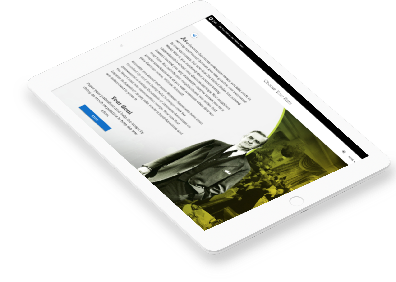
Prototype A on the left (Tab Design) Prototype B on the right (Long Scrolling Design)
Finish your assignment and submit it to your teacher for a grade
Read the teacher comments on the assignment
Teacher Usability Tasks:
Check a student’s progress on an assignment
Review a student’s work on the rest of the assignment
Leave feedback on a student’s activity (comments)
Students Prototype A:
Task #
Success Rate
95% CI
SEQ Mean
1
4 of 5
36-98
5.0
2
5 of 5
51-100
6.2
3
5 of 5
51-100
7.0
4
5 of 5
51-100
6.0
Students Prototype B:
Task #
Success Rate
95% CI
SEQ Mean
1
5 of 5
51-100
6.1
2
4 of 5
36-98
6.0
3
4 of 5
36-98
6.8
4
3 of 5
23-88
6.6
Teacher prototype A:
Task #
Success Rate
95% CI
SEQ Mean
1
6 of 6
55-100
7
2
6 of 6
55-98
7.0
3
6 of 6
55-100
5.8
Teacher prototype B:
Task #
Success Rate
95% CI
SEQ Mean
1
6 of 6
55-100
7
2
6 of 6
55-98
7.0
3
6 of 6
55-100
6.8
Other statistics:
Teacher Net Promoter Score: -50 (A); 16 (B)
Overall User Friendliness (A): 5 excellent, 1 good, 1 okay
Overall User Friendliness (B): 2 excellent, 3 good, 1 poor
Implement
Key Insights on Scrolling
From the usability test, we kept hearing that the header was taking up alot of space for the content. While the solution was usable in the wireframes, it needed to still frame the content.The most screen size according to GA is 1024 by 768. There are 3 different solutions that I came up with to try to accomodate for the large size.
Fixed Header on Scroll
Inline Header
Header Appears on Scroll Up
Visual Explorations
I explore different visual treatments for the tab design. Below are 3 different visual designs. From stakeholder feedback, we decided to go with the blue background (left design).
While mobile devices are rarely used for assignments, I still wanted to make sure the assignment viewer worked cross devices.
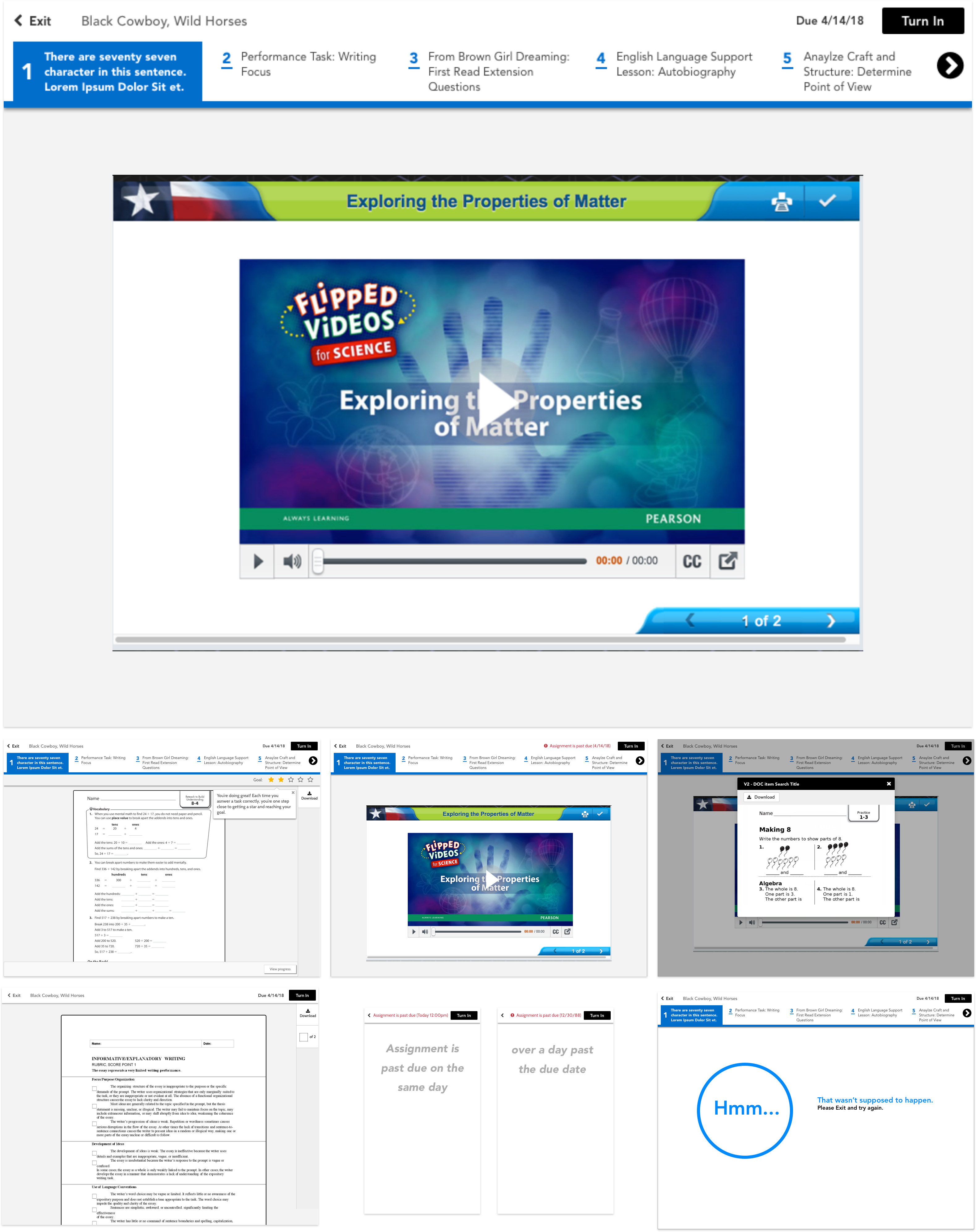
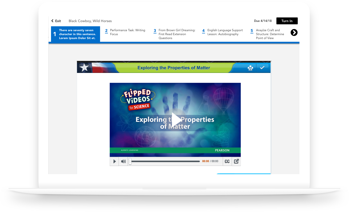
Final Visuals
The final product consisted of many different states. Shown below are only a few of these states, but the Assignment viewer is live in Realize today. Currently, Google analytics shows that the turn in rate has dramatically increased (50%+), which is far better than the previous designs. The next step is to validate even further to see how well we solved the problem, since we want 100% turn in rate.
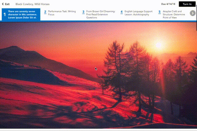 Fixed Header on Scroll
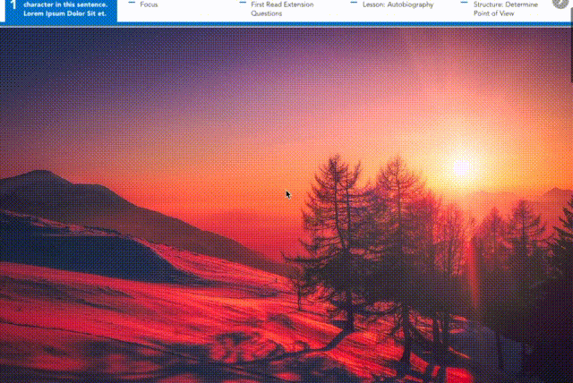 Inline Header
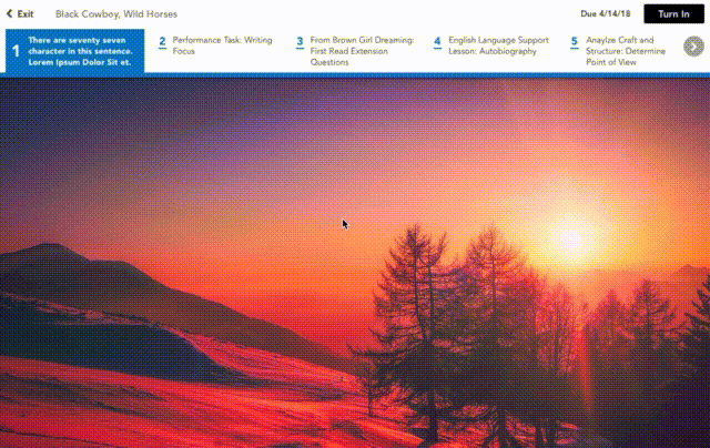 Header Appears on Scroll Up